|
Secrets of Digital Photography Print vs Monitor Help |
|
|
It's a world of color and you only have ink...
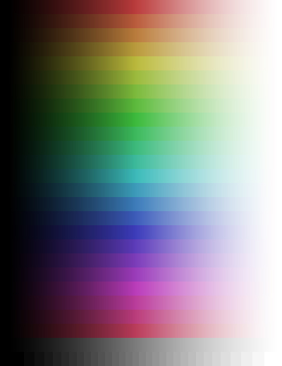
Light from glowing phosphors and back-lit LCDs and paper covered with ink all have different things to say to our eyes. In a sense, it's a wonder that we take all of these to be recognizable images. But when we look closely, we can easily see how different each image delivery system is. So how do you look at the computer and predict the look of the print? Here is some very easy-to-implement help with that. The image for this article is what I call the Subtle Rainbow. It's made from colors in 18 bands that are each 15 degrees apart on the color wheel, and all colors are a maximum of 50% saturated. In other words, not very pure at all. Don't expect brilliant color. Colors are arranged in bands that span each hue from solid black to pure white, plus a continuous gray gradient and a 32-step gray scale. Print the Subtle Rainbow: You print the pattern out on your printer using your favorite ink and paper, and then use that print to compare with your monitor's image. Don't change the image at all. Feed it to the printer without any compensations, the way you would send a file that was perfect. Glossy paper generally gives more depth and range to an image. Again: the point of all this is NOT bright coloration. If the colors look distorted, mushed together, very ragged at the right side of the colors, then your printer may need a lot of help. ICC files for your exact printer may be needed or you may be required to alter the printer driver in a way that evens the colors out a bit more. It's normal to have that right side look a little ragged, because each hue fades differently. The closer the two images agree, the more you will be able to use your monitor to predict how changes you make in editing your image will look in the resulting print. That means you will have to do one of two things (or both) to your computer viewing setup.
Not all editing programs can change the way your images display, but Photoshop 6.0 allows you to adjust the way it shows you the images with a new feature called a Proof Setup. And if you have this program, you have a powerful tool, providing you can get it to work for you. The Subtle Rainbow is designed to provide a visual reference both inside and outside your computer. To change the Monitor: Everybody's monitor is different. Some have only Contrast and Brightness controls, but most monitors have a menu system that goes deeper. See the instructions that came with your monitor to access its controls. Most monitors are set wrong. Sad but true. People set them about as accurately as they set their TVs.
Monitors display images through a "video driver" circuit which is controlled by a small program that tweaks the image on the way to the screen. This driver software can be influenced by various utilities made for this purpose. One of these is Knoll Gamma, created by the Knoll brothers who invented Photoshop years ago. If you have an LCD screen or plasma display, this sort of gamma adjustment program will be your best sort of monitor adjuster. In general, these programs let you balance colors, adjust the white point of your screen and compare the results of what the improved version looks like. To change the way images display: Photoshop has had "display profiles" since version 5.0 appeared in 1998. These settings change the way the image looks on screen without actually changing the file itself. To change the way images display with Photoshop 5.0 or 5.5, first use the File>Color Settings>Profile Setup... menu choice to open the profile window. Un-check every box and set all six line items to "None" or "Ignore". Then open the menu window with File>Color Settings>RGB Setup... and enter this:
Then use the View>Preview> and choose one of the CMYK, Macintosh RGB, Windows RGB or Uncompensated RGB choices. Your screen image will change to look closer to the way it will in print, on a Mac or on a Windows machine. It helps, but it is far from really being accurate. To adjust the way images display in Photoshop 6.0 and higher, you follow the route to the same idea a little differently. First you go to the profile setup menu under Edit>Color Settings. For the moment, set the window to "Color Management Off" and view the Subtle Rainbow on your monitor or LCD screen. Under View>Proof Setup you will find a number of choices. Play with these to see how they behave. As you select Working CMYK, Macintosh RGB, Windows RGB, and Monitor RGB the colors on screen are altered with each choice. One of them may be better than the others and show the colors closer to the way the print looks. Make a note of it. Then try the Custom menu item. A new window opens and it should have a Preview item checked. Here you will find many, many profiles that attempt to reproduce a wide range of monitor and viewing assumptions. Select them and continue to make comparisons from screen to print. Note the ones that seem to be an improvement over the first group you tried. You might have to try them all just to be sure you'd seen everything. Pretty soon you will see that many of them seem to either produce no effect or very little. Persevere. Then use the one setting that seems to do the best job. I wouldn't be surprised to hear that it was one of the first group under the View menu. Applied Experience Now make some real-world photographic prints. Chances are good that the new Proof Setting you have found will make screen images much closer to the printed page. With each paper and printer type, your preferred setting may change. That's to be expected. Make a note somewhere so you can implement these preferred Proof Settings whenever you wish. Two images are provided. Each is a compressed TIFF and they are only about 112 KB in size. The one on the left is for Macintosh computers, the one on the right are for Microsoft-powered computers. I present both in case anybody has a hiccup with one or the other. Except for LZW lossless compression Byte order, they are identical. To Open the images: What you see here is cropped and doesn't show the entire image. Open each in a new window. Now you can see the full image. Copy this to your desktop and park it somewhere handy. Note: In Internet Explorer, the "Save As A Source" option works. Some computers may let you simply drag it to your desktop. If you don't have QuickTime on your computer, you may not see these TIFF files at all. Just dowload or copy the JPEG file below. Print it at 72 ppi so it fills the center portion of a letter-size page. Size is not critical, however, as long as you can see each band and patch of color and shading. Macintosh Windows
Here is the JPEG (of extremely high quality) for those browsers that don't see the above TIFFs as easy as Internet Explorer. (The image file is bigger than it shows here.)  Have at it. It could make working in Monitor color space easier. -iNova |
|
| Tools can set you free. This one will show you how different your monitor looks from your printer. But the good news is-- | ||
Get the eBook. We have a secure order page that will allow previous eBook owners to upgrade for low cost, too. Or you can call direct and order from the publisher by phone or FAX.
Phone:(310) 475 2988 (M-F 9-5 Pacific Time, 12-8 Eastern)
FAX (310) 475 9486 (24hrs).

 The world will always have more hi-fi
color than your print. And your monitor will be between print
and real-life. You can't have it all, because each is coming
from a different sort of place.